I’ve been using Wardley Maps to think through strategy for Calliope AI, and I’m convinced more people should know about this tool. It’s changed how I approach technical strategy, and I want to bring it to more engineers.
What is a Wardley Map?
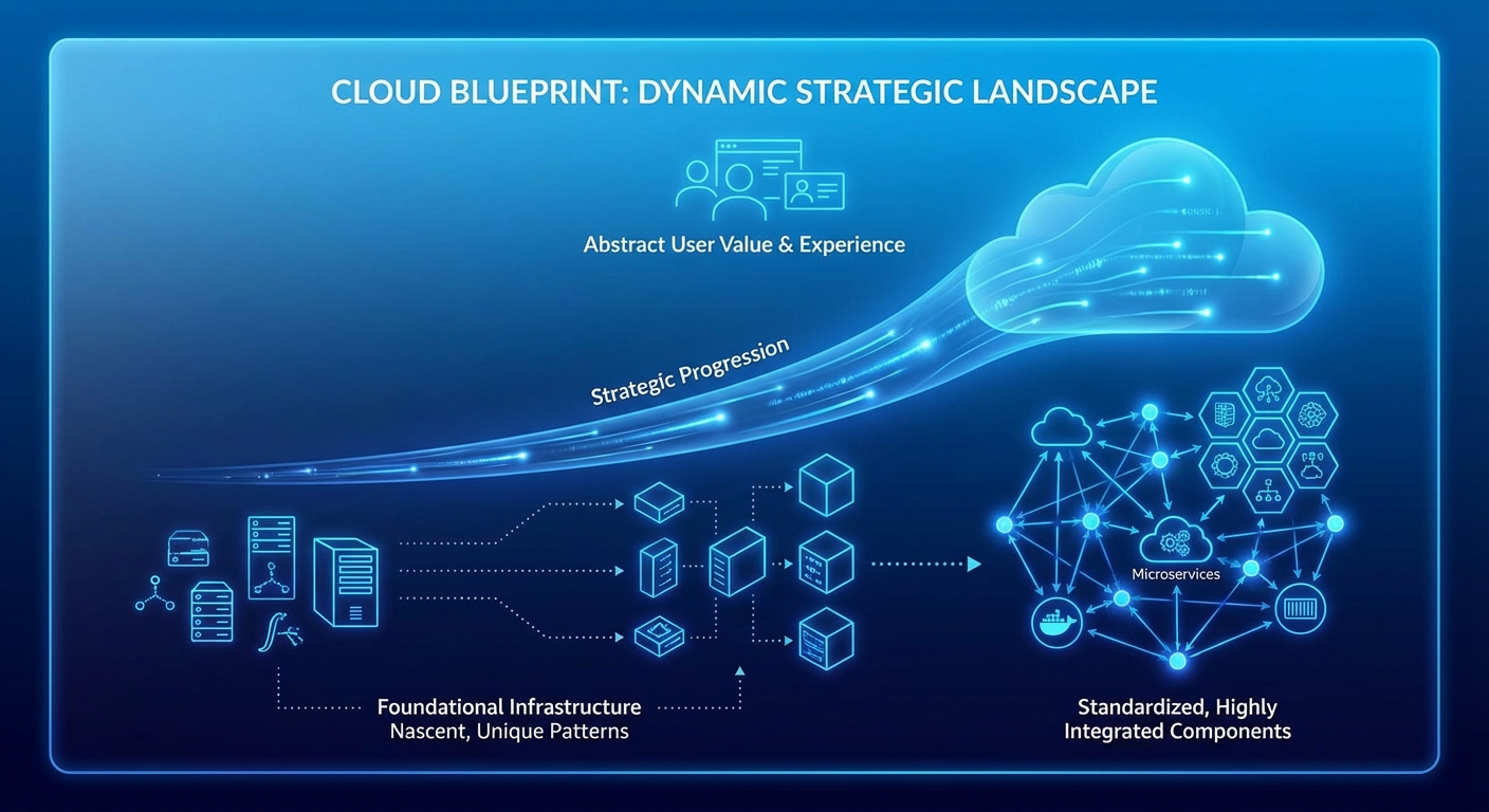
Created by Simon Wardley, it’s a visual way to map out your value chain and understand where things are headed. The map has two axes:
- Y-axis (Visibility): From infrastructure at the bottom to user-facing needs at the top. This represents your value chain—what the user sees vs what supports it.
- X-axis (Evolution): From Genesis (novel, uncertain) through Custom, Product, and finally Commodity (standardized, boring).
Every component in your system sits somewhere on this map. And everything moves left to right over time. That’s the key insight: evolution is predictable. Today’s cutting-edge technology is tomorrow’s utility.
A Quick Example
Imagine mapping a typical SaaS application:
wardleyMap
    title SaaS Application Stack

    component User Need [0.95, 0.7]
    component Web App [0.8, 0.6]
    component API [0.65, 0.55]
    component Auth [0.5, 0.8]
    component Database [0.4, 0.75]
    component Compute [0.2, 0.9]

    User Need -> Web App
    Web App -> API
    API -> Auth
    API -> Database
    Database -> Compute
At the top: the user need (visible, valuable). At the bottom: compute infrastructure (invisible, commodity). In between: your differentiating capabilities—the things that make your product unique.
Why I Use It
When planning Calliope’s architecture, I needed to answer questions like:
- Which AI capabilities are commoditizing fast? LLM inference is racing toward commodity. Embedding generation already is. That means building there is competing on price, not differentiation.
- Where should we build vs buy? If something is commodity (far right), buy it. If it’s your differentiation (middle-left), own it.
- What’s our actual differentiation? The map forces you to be honest. If your “secret sauce” is sitting at commodity evolution, you don’t actually have a moat.
A Wardley Map makes these tradeoffs visible. You can see where you’re competing on commodity ground (bad) vs where you have genuine strategic advantage (good).
The Movement Matters
The real power comes from understanding movement. Everything evolves. The question is: are you positioned for where things are going, or where they were?
Three years ago, running your own LLM inference was Genesis—experimental, custom, expensive. Today it’s rapidly becoming Product/Commodity. If your strategy assumed inference was your moat, you’re about to have a bad time.
Wardley Maps help you see this coming and plan accordingly.
The Problem
The concept is powerful. The tooling? Not so much.
I wanted Wardley Maps in my docs, my READMEs, my planning artifacts. Native to the places I already work—GitHub, Notion, my markdown files. I wanted to version control my strategy diagrams alongside my code.
And I couldn’t find a good solution.
That’s when I decided to build it. More on that next time.
Resources
If you want to go deeper on Wardley Mapping:
- Simon Wardley’s book (free on Medium)
- Learn Wardley Mapping
- Wardley Maps community

